

subscribe to our Newsletter
Small kitchen paint colors: Exploring 10 Tones for Limited Spaces

Are you ready to spice up your kitchen with a new paint color? With so many different shades and options to consider in your home, it makes choosing a paint color quite difficult, especially for smaller kitchens. Many colors have a tendency to make kitchens appear smaller or bigger than their actual size.
At Lily Ann Cabinets, we have all the information you need to know about paint colors for your kitchen before you start off the process! Read along to explore our 10 ideas for paint colors most ideal in smaller kitchens!
1. A Darker Appeal
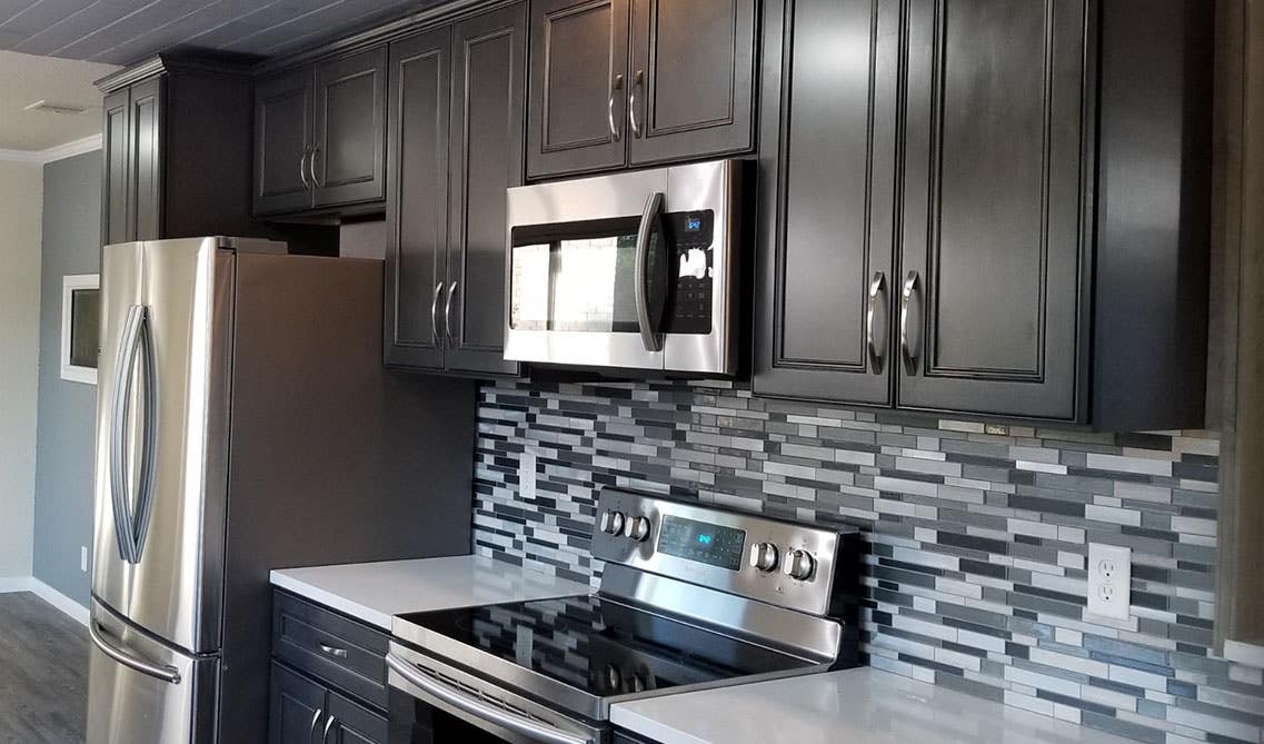
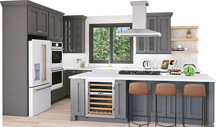
Lily Ann Cabinets: York Driftwood Grey
A dark, bold kitchen paint tone gives the space more personality and adds creativity in comparison to a plain, all white, or lightly colored kitchen. Not only does a darker look give more of an opportunity to express oneself, but it is also more realistic to keep it clean. It is easier to maintain as it hides dirt, scratches, and stains correspondingly well compared to any other tone.
Dark colors can easily give the opposite appeal most people are looking for, by making the kitchen appear smaller and more cramped than it actually is. It is important to plan your design out strategically before jumping into your project.
One approach could be with accent walls to create more contrast. One wall is painted with a darker toned color with dark cabinets as the other wall, perpendicular from, introduces a touch of something a bit lighter.
Related: 14 Amazing Color Schemes for Kitchens with Dark Cabinets
2. A Mellow Yellow
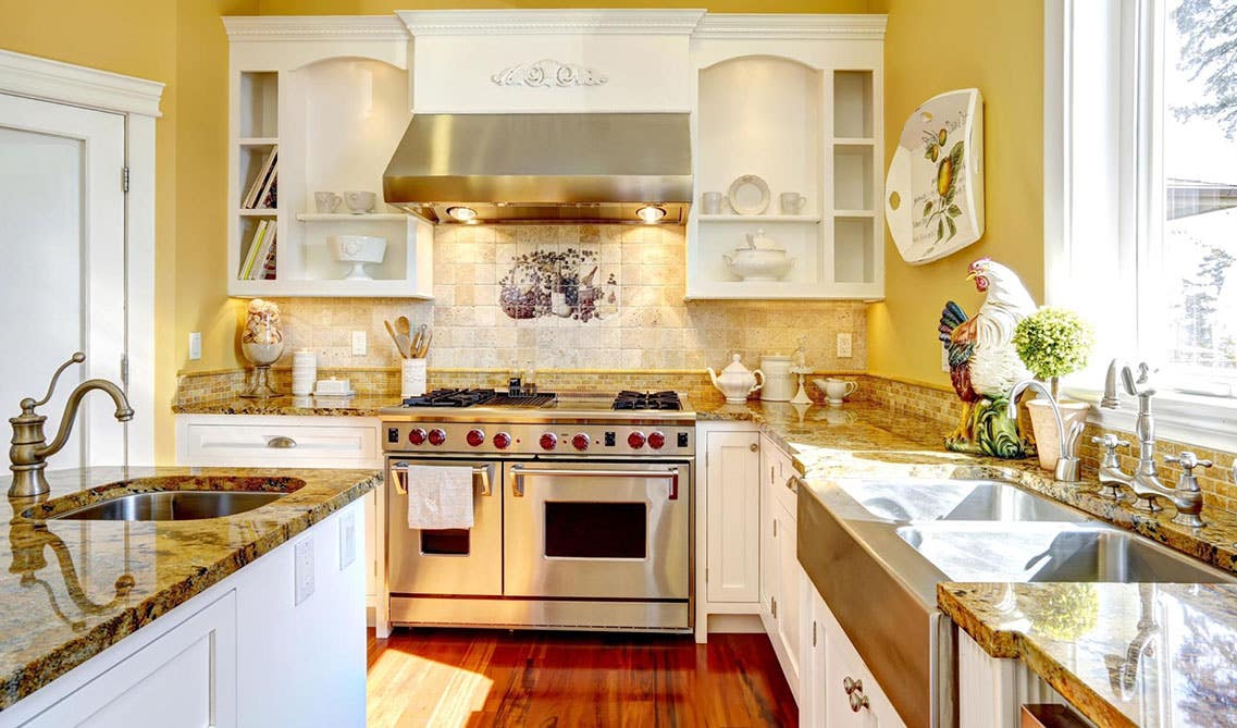
If you are looking to bring more light and brighten up your kitchen, then yellow painted walls will be your new favorite look! Yellow paint is ideal to enhance the light in your small kitchen especially if it has fewer resources of natural light through the windows.
You cannot go wrong with light yellow walls as they make any small space appear bigger than it actually is. Also, this tone matches just about any cabinet color, making it easy to match. One of our favorite combinations is with White Shaker Elite Cabinets. It creates a clean and bright look while maximizing the space’s potential with the effect of making it appear bigger.
3. Find a Focal Point
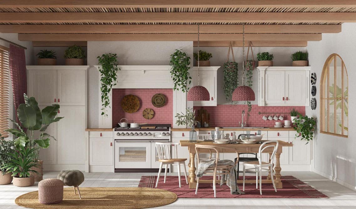
One of the most simple ways to creatively design your kitchen tones is by adding a focal point. This look is best accomplished when surrounded with a lighter tone base and wall cabinets such as a light tan, off white, or bright white. Our Colorado White Shaker Cabinets and York Linen Cabinets are both excellent options to satisfy this model.
From there, you can add whichever tone you feel would give your kitchen the perfect pop of color it needs! Popular options include pink, teal, bright or navy blue and forest green. A bright focal point will make your kitchen add depth and make it appear bigger.
4. Create Contrast
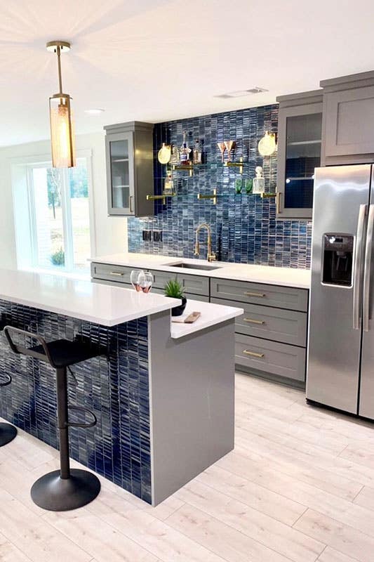
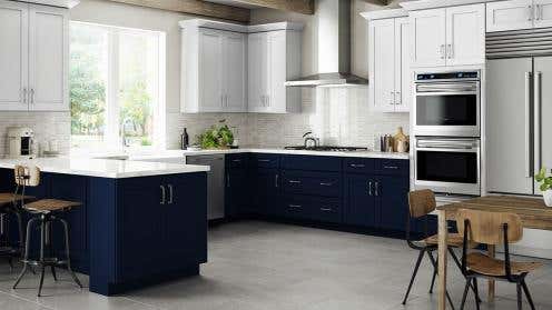
Lily Ann Cabinets: Grey Elite Shaker
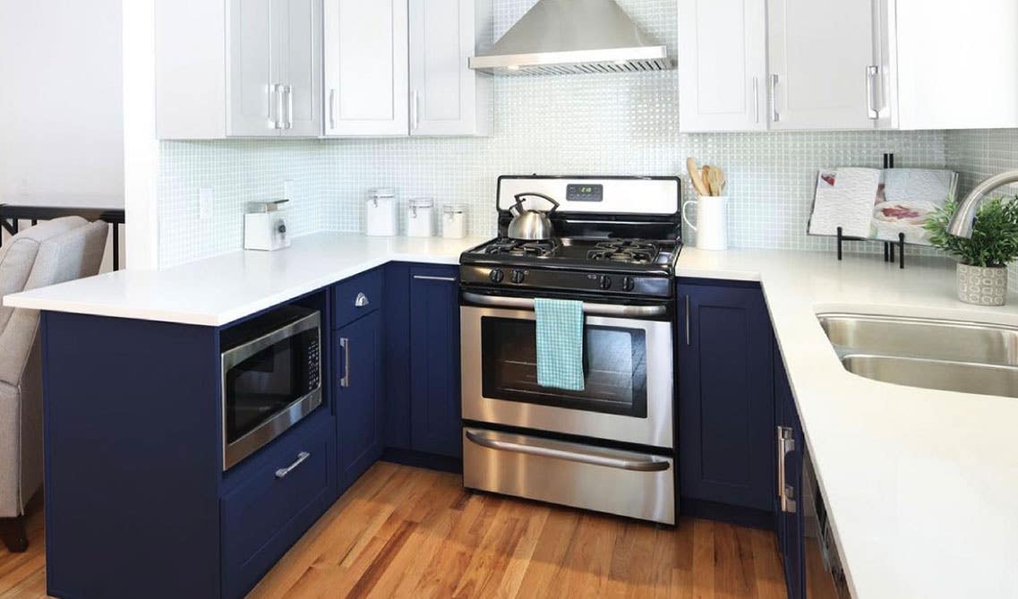
With contrasting tones between your walls and cabinets, your cramped kitchen will be left feeling spacious and open. Creating a contrasting design opens a variety of options as you can match with just about any color, bold or neutral. White walls with navy blue or grey shaker elite cabinets, or all white walls and cabinets with colored backsplash, or even two different colored cabinets for your base and wall cabinets or different colored island cabinets.
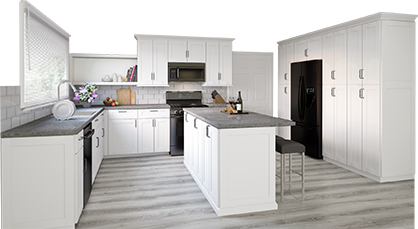
3D Kitchen Visualizer Tool
Bring your dream kitchen to life with our free kitchen visualizer!
Design Now5. Pretty In Pink
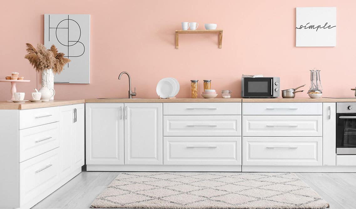
A light pastel toned pink kitchen creates an enticing and bright atmosphere. Its radiant color introduces more light into the kitchen and gives the allusion to a larger space. Try adding reflective surfaces such as tiled finished floors, with white marble countertops, finished off with our white porcelain subway tiles. This combination creates a fun and glossy kitchen in any home!
6. Multi- toned
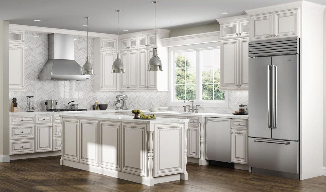
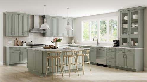
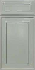
Lily Ann Cabinets: Charleston Linen
Using the same color throughout your kitchen in different tones is an easy way to make everything look cohesive and ensure that the colors blend. To keep your color scheme looking organized, choose tones that are not too different from each other, but also not too similar where they look like they are supposed to be the same. This will create a clashing appeal. Instead, choose tones that are fairly close to each other, for example, off white colored walls with tan cabinets such as charleston or bristol linen.
Try adding extra fixtures throughout your kitchen to add to the visually pleasing aesthetic by incorporating metals. Some ideas of what to include are metal cabinet pulls, a range hood, or lighting fixtures.
7. Keeping it Natural and Neutral
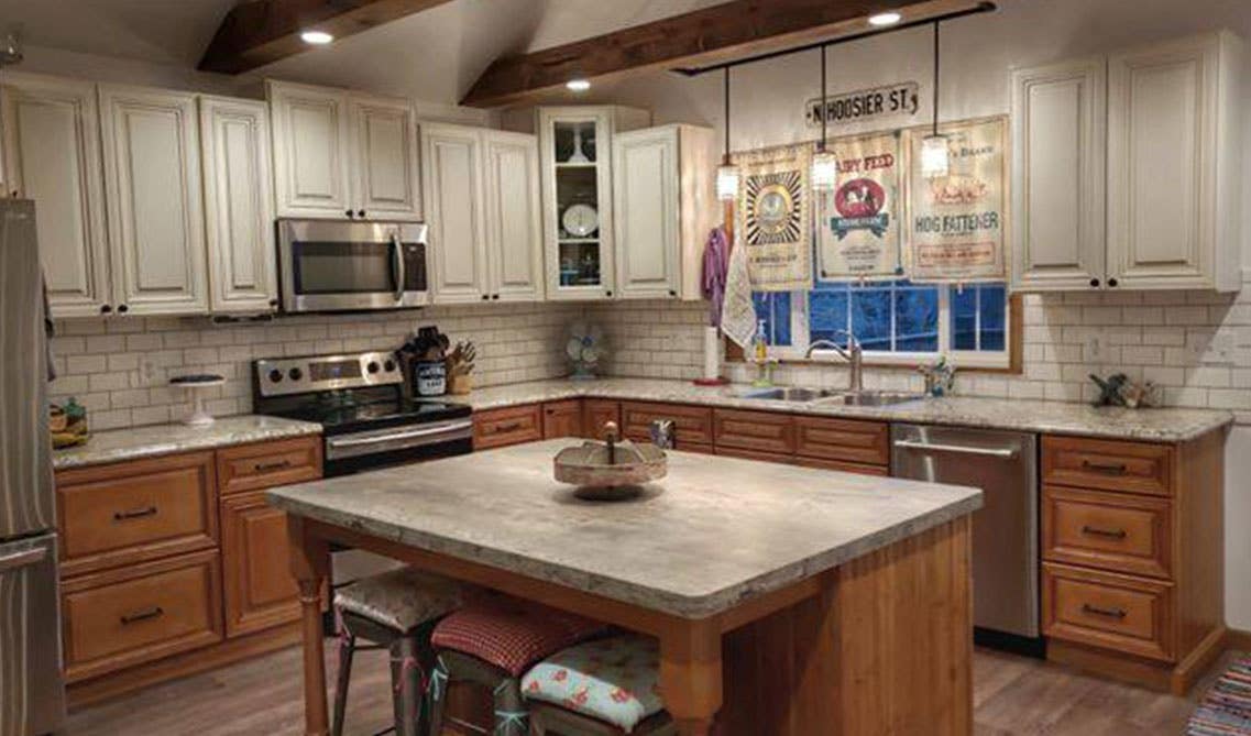
Lily Ann Cabinets: Charleston Linen & Cinnamon Shaker
If you prefer a more simple and cozy approach, stick to neutral tones with more natural looking appliances. With off-white or light brown walls, natural tone cabinets, and finished wooden, stone, or granite countertops, it gives off a rustic kitchen design, perfect for any sized kitchen. Add a touch of wooden fixtures such as additional cabinets, floating shelves, lighting, and island or bar stools to finish off the look of an inviting and charming aesthetic.
8. Beautiful & Blue
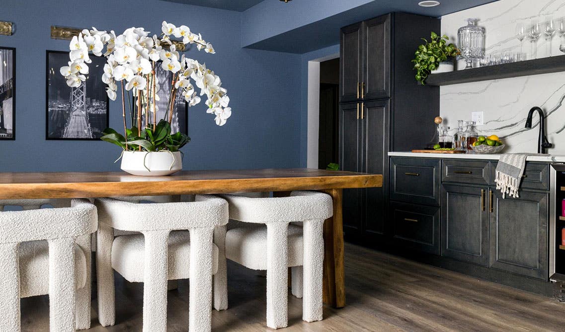
A beautiful and timeless option is a blue kitchen. Blue kitchens are very versatile and offer multiple color scheme options, but the most popular are pastel and navy blues. It can act as a neutral or be used as a color pop. It could be used as a light blue accent wall with white surrounding walls, and grey, white, dark, beige, or navy cabinets match well with the color.
Blue is a classic option that can bring contrast into your kitchen. Blue painted tones are seen being most successful in small kitchens when they are seen a little at a time. Another great way to introduce blue into your kitchen is with a navy blue island. Not only will it be visually appealing, but it will also be the perfect space for storage to hide clutter around your kitchen in your navy blue shaker cabinets.
9. White Out
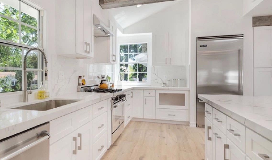
Lily Ann Cabinets: White Shaker Elite
One of the most elegant and clean looking kitchens, of course, is all white. White will easily brighten up your kitchen and make it feel more open. This is the best option if you are unsure of what look you want because it can create modern styles, contemporary, farmhouse styles, etc. White allows you to be more flexible and forgiving when it comes to your other color schemes, decor, and appliances as it matches well with anything.
10. All One Tone
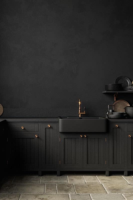
Consider creating a space in your kitchen where the cabinets and walls are both painted in the exact same color. This can create a modern and trendy space that differs from other commonly seen kitchen styles. Having a one-colored space is ideal in smaller areas because it makes the space seem bigger since there are no different toned appliances to break the colors up.
In Conclusion…
In conclusion, selecting the right paint color for a small kitchen can make a significant impact on the overall aesthetic and functionality of the space. By considering various factors such as lighting, cabinet colors, and personal preferences, you can create a visually appealing and inviting kitchen that feels more spacious.
Worried you won’t love your new kitchen design? No problem! Before you start, try our free kitchen visualizer, or speak with one of our experts to explore and design your actual kitchen layout.
Whether you opt for light and airy tones to open up the space, bold and vibrant hues to inject personality or a harmonious blend of neutral shades, remember that the perfect color choice is subjective and should ultimately reflect your style and aspirations for your small kitchen. So go ahead, release your creativity, and transform your compact kitchen into a delightful culinary haven with the power of paint!
Related Blogs:
- Make a Small Kitchen Layout Feel Bigger With Clever design ideas
- 10 Incredible Small Kitchen Island Ideas You'll Want to Copy Immediately
- 12 Luxurious Small Kitchens To Inspire Your Remodel
- Maximizing Space in a Small Kitchen Pantry with 5 Clever Ideas
FAQs:
1. What colors make a small kitchen look bigger?
Lighter colors make a small kitchen appear bigger. Pastel colors are perfect if you are looking to add more color while making it appear larger, such as yellows, blues, pinks, and greens. Neutral light colors also work well, for example, white, beige, light grey, and cream tones.
2. What are modern kitchen colors?
Modern kitchen colors are most commonly seen in shades of red, blue, yellow, green, white, and orange.
Shop Related Cabinet Lines
Recent Blogs
Kitchen Decor
What Your Wife Really Wants for Mothers Day
Kitchen Cabinets,Wood Cabinets,Cabinet Tips,Cab...
Laminate vs. Wood Cabinets: Choosing the Best Material for Your Needs

25+ Ways To Style Grey Kitchen Cabinets August 1, 2019
18 Unique Modern Bathroom Ideas | Cabinets, Vanities + More October 22, 2019
11 Fresh Kitchen Backsplash Ideas for White Cabinets March 5, 2020
What Your Wife Really Wants for Mothers Day April 25, 2024
Why You Should Embrace a Solid Slab Backsplash April 4, 2024



Comments