


Colors that calm honey oak's orange-yellow undertone work best. On walls, that means soft warm whites, greige, muted sage or olive green, and blues from pale blue-grey to navy. For countertops and backsplash, pick white or cream. Avoid anything that repeats the orange: yellow-beige walls, tan speckled granite, or a floor the same tone as the cabinets.
- Honey oak's undertone is orange-yellow. Every good pairing either calms that orange or contrasts with it. None of them match it.
- Walls: soft warm white, greige, muted green or blue. Blue sits opposite orange on the color wheel, which is why it works.
- Countertops and backsplash: white or cream is the most reliable. Speckled tan granite is the classic mistake.
- Floors: clearly lighter or clearly darker than the cabinets, never within a shade of them.
- Hardware: matte black for contrast, bronze for quiet warmth, brass to lean into the gold on purpose.
- Test in your own light. Warm bulbs push honey oak toward orange; check every sample against a door, day and night.
- Lily Ann doesn't make oak cabinets. We sell the contrast side: green, white and antique white cabinets for an island, plus hardware and SPC flooring.
Why Honey Oak Is Hard to Pair: the Orange-Yellow Undertone
Honey oak is oak, usually red oak, under a clear or amber finish that has turned golden over the years. Its orange-yellow undertone is both the problem and the answer. Colors that sit opposite orange calm it down. Colors that repeat it make the cabinets look more orange than they really are.
Many clear finishes darken toward amber as they age, so two kitchens both called "honey oak" can look quite different: one a pale gold, the other close to orange. If your cabinets have been in place a long time, expect the stronger version. Our guide to oak kitchen cabinets explains why it was the finish, not the wood, that gave oak its dated reputation.
Check your undertone first: the printer-paper test
Hold a sheet of plain white printer paper flat against a cabinet door in daylight. Paper is close to a pure white, so it shows which way the wood leans. If the oak looks gold or yellow next to it, you have the lighter honey tone. If it looks orange or pinkish-orange, you have the stronger version, and the calming colors below matter even more. Do it again at night under your own lights, because warm bulbs push honey oak further toward orange.
The Color Rule Behind Every Pairing
On a color wheel, blue sits directly opposite orange, and opposite colors calm each other when one of them is soft and muted. That is why blue-grey, navy and many greens look good next to honey oak, while yellow, peach and tan make it look more orange. Learn that one rule and you can judge any paint chip, tile or countertop sample yourself.
Two more rules finish the job:
- Contrast, not matching. Honey oak looks best next to something clearly lighter or clearly darker. A surface within a shade of the cabinets makes the whole room read as one orange-brown block.
- Muted beats bright. A dusty sage or a greyed navy calms the oak. A bright, saturated blue or lime green fights it.
Here is how that plays out on every surface in the kitchen:
| Surface | Works with honey oak | Avoid | Why |
|---|---|---|---|
| Walls | Soft warm white, greige, muted sage or olive, blue from pale blue-grey to navy | Yellow-beige, tan, peach, terracotta | Blue and green sit opposite orange and calm it; yellow and peach repeat it |
| Countertops | White or cream quartz, white with grey veining, solid black or charcoal | Speckled tan, gold or brown granite | A light top is the biggest contrast you can add; speckled tan repeats the oak |
| Backsplash | White or cream tile, soft green or blue tile, marble-look tile with grey veining | Tan or brown tile close to the cabinet color | It sits right against the wall cabinets, so any near-match is obvious |
| Flooring | Clearly lighter (pale wood look, light tile) or clearly darker (deep brown) | Any floor within a shade of the cabinets | Two matching woods merge into one orange mass |
| Hardware | Matte black, oil-rubbed bronze, brass or gold, brushed nickel | Hardware that disappears into the wood | Black adds contrast; brass leans into the warmth on purpose |
| Island | Painted navy, green, white or antique white | Another honey tone | A painted island breaks up the wood without replacing it |

Wall Paint Colors That Go With Honey Oak Cabinets
The walls are the cheapest surface to change, so start there. Four color families work well with honey oak: soft warm whites, greige, muted greens, and blues. Each works for a different reason, and each has a version that goes wrong.
- Soft warm white. The safest choice. Pick a white with a little warmth in it rather than a stark, blue-tinged white. A very cool white can make the oak look more orange by contrast; a soft white lets the wood look warm rather than loud.
- Greige. A grey-beige sits between warm and cool, so it neither repeats the orange nor fights it. Choose one that leans slightly grey. A greige that leans yellow turns into beige, and beige is the problem color.
- Muted green, such as sage or olive. Green sits next to blue on the color wheel and has an earthy feel that suits wood. Keep it dusty and greyed. It is the gentlest way to add real color.
- Blue, from pale blue-grey to navy. The direct opposite of orange, so it has the strongest calming effect. Use a pale blue-grey on all the walls, or save navy for one accent wall or an island.
Wall colors to avoid with honey oak
- Yellow-beige, tan and yellowy cream. These repeat the oak's own undertone. The walls and cabinets merge and the whole kitchen looks yellower.
- Peach, coral and terracotta. Attractive colors, but they sit right beside orange on the wheel and push the oak further toward it.
- Cold mid grey. Grey can work, but a cold mid grey often makes honey oak look dated and the grey look dirty. If you want grey, go lighter and warm it slightly, which is greige.
Why this guide doesn't name paint colors
Most advice on this question is a list of named colors from the big paint brands. Those lists can help you pick a chip, but a paint name tells you nothing about how that color will look next to your oak, under your light. Take the color family from this guide to the paint store, bring home two or three sample pots, and paint large swatches right beside a cabinet. Look at them in the morning, in the afternoon and at night before you choose.
Countertops That Go With Honey Oak Cabinets
A white or cream countertop is the most reliable choice with honey oak, and after the walls it is the biggest contrast you can add. White quartz, or a white top with soft grey veining, brightens the oak without competing with it. The countertop to avoid is speckled tan, gold or brown granite that repeats the cabinet color.
- White or cream quartz. The pairing most people search for, and the easiest to live with. A bright white gives the most contrast; a cream or soft white feels gentler and more traditional.
- White with grey veining. A marble look adds pattern, and the grey in the veins brings in a cool note that balances the oak.
- Solid black or charcoal. Strong contrast that looks sharp against honey oak, but it makes the room darker. Best in a kitchen with good natural light.
- Butcher block. Possible, but it is wood on wood. It only works if the countertop wood is clearly lighter or darker than the cabinets.
Speckled tan and gold granite is the countertop many honey oak kitchens already have, and it is a big reason they can look dated: two busy, warm surfaces with the same undertone, stacked on top of each other. If you are only changing one thing, the countertop often changes the room the most. Our guide to the best quartz countertop colors goes through the options in more detail.
To be clear about what we sell: Lily Ann makes cabinets and sells hardware and some flooring, but we do not sell kitchen countertops. The quartz tops in our store are bathroom vanity tops. The countertop advice here is general, not a sales pitch.
Backsplash Ideas for Honey Oak Cabinets
The backsplash sits directly against the wall cabinets, so it is where a near-match looks worst. Choose tile that is clearly lighter than the oak, such as white, cream, or a soft green or blue, and let it link the countertop to the walls. Avoid tan or brown tile close to the cabinet color.
- White or cream tile. The safe choice, and the natural partner for a white countertop. Tile with slight color variation, like a handmade look, feels warmer than a flat white.
- Soft green or blue tile. Brings the calming color in at eye level without painting a whole wall. Keep it muted.
- Marble-look tile with grey veining. Works well above a plain countertop and adds the cool note honey oak needs.
- Light grout. Grout matters more than people expect. A light grout keeps the backsplash calm; a dark or tan grout draws a grid of lines that repeats the oak's warmth.
Should the backsplash be lighter or darker than the cabinets? With honey oak, lighter is almost always easier. A dark backsplash between oak wall cabinets and a countertop makes the middle of the kitchen feel heavy.
Flooring That Goes With Honey Oak Cabinets
Pick a floor that is clearly different from the cabinets, either noticeably lighter or noticeably darker. The one floor that almost never works is a wood or wood-look floor in the same honey tone, because the cabinets and floor merge into one orange mass.
- Lighter wood-look floors. A pale or whitewashed wood look, in real wood, laminate or vinyl plank, opens up the room and makes the oak look like a deliberate accent.
- Warm greige or light tile. A greige or light stone-look tile softens the orange without looking cold. Very cool grey tile can clash, so check its undertone against a cabinet door.
- Much darker floors. A deep brown floor grounds the room and makes the oak look lighter by comparison. It shows dust and scratches more, so think about how busy your kitchen is.
Should the floor be lighter or darker than the cabinets? Either works, as long as the difference is obvious from across the room. Lighter floors make a kitchen feel bigger; darker floors make it feel more grounded. The only real failure is "almost the same".
Lily Ann sells SPC vinyl flooring, a waterproof vinyl floor, in a small range of wood looks that includes a White Oak finish and a Rustic Brown finish. We have not tested these against honey oak cabinets, so hold any floor sample against a cabinet door in your own light before you buy. If you can't easily tell the two apart, it's the wrong floor.
Hardware for Honey Oak Cabinets
Matte black gives the most contrast against honey oak and looks the most current. Oil-rubbed bronze is warm and low-key. Brass and gold lean into the oak's warmth on purpose, which works when the rest of the room is calm. Brushed nickel is the neutral middle ground.
The one rule is that hardware should be clearly visible against the wood. A pull that disappears into the door does nothing for it. Using two finishes, like black pulls with a brass faucet? Our guide to mixing and matching cabinet hardware finishes shows how to combine them. For hardware style, such as pulls versus knobs, shapes and sizes, see our guide to how to make oak cabinets look modern. Lily Ann sells cabinet knobs and pulls in a range of finishes, including black and gold.
Keep the Oak, Add a Painted Island
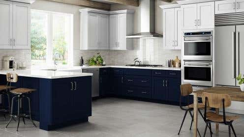
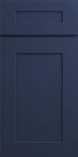
If you want the biggest change without replacing the cabinets around the walls, add or replace the island in a painted color. A navy, green, white or antique white island breaks up the wood, puts the calming color at the center of the room, and turns honey oak into one half of a two-tone kitchen.
It also avoids a problem people often run into: matching new cabinets to old honey oak is very hard, because the old finish has aged and new wood has not. A contrasting island does not need to match anything. Our guide to two-tone kitchen color combinations shows how the look works more generally.
Lily Ann does not make oak cabinets, so we can't sell you a cabinet to match or extend a honey oak kitchen. What we can offer is the contrast side of a two-tone look. Of the island colors above, our range covers green, white and antique white:
- Craftsman Lily Green Shaker for a green island.
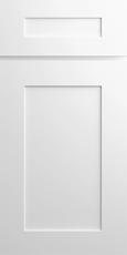
- White cabinets for the most contrast, or antique white cabinets for a softer off-white.
Before you order, get a full-size sample door and stand it next to your oak cabinets for a few days. At that size you will see quickly whether the pairing works in your light.

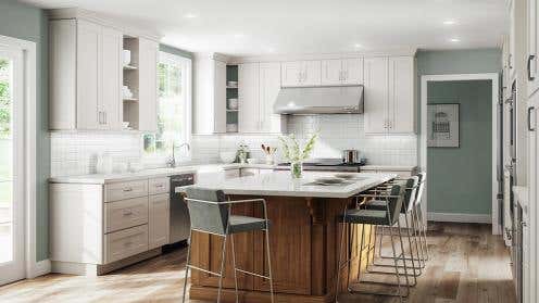
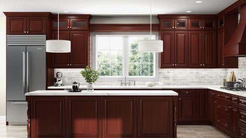
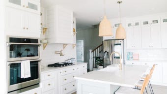
The photo shows the same idea with our Charleston Toffee finish, a warm brown rather than oak, around an antique white island.
Three Pairings That Make Honey Oak Look Dated
Honey oak itself is rarely the problem. The dated look usually comes from what surrounds it, and three combinations cause most of it.
- Everything warm and everything the same. Honey oak cabinets, a honey oak floor, tan granite and yellow-beige walls. There is no contrast anywhere, so the room reads as one orange-brown block.
- Wood on wood in the same tone. A floor, table or butcher block within a shade of the cabinets. Two woods need to be clearly different to look intentional.
- Warm bulbs on warm wood. Very warm light, around 2700K, makes honey oak look deeply orange. A more neutral white bulb, around 3000K to 3500K, often calms it without making the kitchen feel cold.
If You'd Rather Change the Cabinets
This guide is about pairing colors with honey oak you are keeping. If you would rather change the cabinets themselves by painting, refinishing or replacing the doors, our article on updating oak cabinets for a modern look covers each option. Our oak cabinets guide, linked above, gives an honest answer on whether keeping them is worth it at all.
The Short Version
Honey oak has an orange-yellow undertone. Pair it with colors that calm that orange, such as soft warm whites, greige, muted greens and blues, and give it clear contrast on the countertop, backsplash and floor. Avoid anything that repeats the orange or matches the wood too closely. Test every sample next to a cabinet door, in your own light, before you commit.
If you want to add contrast with cabinetry, a painted island is the quickest route. Start with a full-size sample held against your oak.








Comments