


Greige, a mix of grey and beige, is still a good cabinet color because it works with both warm wood and cool grey floors. It is no longer the automatic choice, though: designers quoted in The Spruce call it overused, while designers in Southern Living say greige and taupe-grey feel more timeless than cool greys. What's going out is cold, flat grey, so pick a greige with visible warmth and pair it with warm wood, white counters and black or brass hardware.
- Greige = grey + beige. Next to a true grey it looks warm; next to a true beige it looks cool.
- Not out, just not automatic. Designers are split for 2026. What's actually fading is cold, flat grey. Warm greige sits on the right side of that shift.
- Taupe has more brown than greige; beige has more yellow or pink. Our beige and taupe guides cover those two in depth.
- No Lily Ann line is called greige. Grey Shaker Elite sits on the grey side, York Driftwood Grey is the closest to a deep greige, and York Linen and Charleston Linen are the pale end.
- Pairings that keep it current: white quartz, warm wood, and black or brass hardware. All-grey everything is what looks dated.
- Test it three ways: next to a true white and true grey, against your floor and counter, and in morning and evening light.
- Sample before you buy. The first two door samples are free, per Lily Ann's line pages (checked September 21, 2026).
What Is Greige?
Greige is a mix of grey and beige. It has the cool, clean base of grey with enough warm beige in it that it doesn't feel cold. That's why it became the default neutral for kitchens over the last decade: it sits comfortably with both warm wood floors and cool grey tile.
The catch is that "greige" covers a wide range. Some greiges lean a little green, some a little violet, and some drift toward brown. Next to a true grey, a good greige looks warm. Next to a true beige, it looks cool. If it looks like neither, it's doing its job.
Greige vs. grey vs. beige vs. taupe
| Color | What it is | Reads as | Easiest with |
|---|---|---|---|
| Grey | Black and white, little or no warmth | Clean, cool, can feel flat | Chrome, white, cool stone |
| Greige | Grey with beige mixed in | Soft, balanced, "warm grey" | Grey tile or light oak, white quartz, black or brushed-nickel hardware |
| Beige | Light brown with yellow or pink warmth | Warm, sandy, can look dated if very yellow | Warm wood, brass, cream tile |
| Taupe | Grey-brown, more brown than greige | Earthy, deeper, mushroom-like | Wood floors, warm whites, brass |
If you already know you want something warmer than greige, our guides to beige kitchen cabinets and taupe kitchen cabinets go deeper on those two.
Is Greige Out in 2026?
Not out, but no longer the automatic choice. Designers are split, and it helps to know both sides before you commit to a whole kitchen.
- The case against: A designer quoted in The Spruce's 2026 list of outdated paint colors says greige has become the default for everything and has lost its character. Google's AI summary for this question says the same thing more bluntly: greige has been used so widely that it can now look "builder-grade."
- The case for: A designer quoted in Southern Living's 2026 list says cool greys are starting to feel sterile, and that greige or taupe-grey feel more harmonious and timeless in rooms with mixed textures. Google's AI summary also notes that greige stays a safe, neutral backdrop when you sell.
The pattern in both articles is the same. Cold, flat greys are what's going out. Warmer neutrals are what's coming in. A greige with real warmth in it sits on the right side of that shift. A greige that's really just a light grey sits on the wrong side.
The other thing that dates a kitchen faster than cabinet color is everything around it. A greige kitchen with all-grey tile, grey counters and chrome everywhere looks like 2015. The same cabinets with warm wood, a white counter and brass or black hardware look current.
Which Lily Ann Finishes Come Closest to Greige?
Straight answer first: Lily Ann doesn't sell a cabinet line called "greige," and none of the line descriptions use the word (checked September 21, 2026). What we do have is a grey, a deeper warm grey and two soft linen off-whites that sit on either side of greige. Here's an honest read of each, using Lily Ann's own descriptions:
| Finish | Door style | How Lily Ann describes it | Where it sits next to greige |
|---|---|---|---|
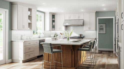
| Grey Shaker Elite | Shaker | "Elegant, on-trend grey"; "this neutral tone" | The grey side. Reads lighter and softer in real kitchens than in product photos. |
| York Driftwood Grey | York, flat panel with glaze | "A deep, moody grey" | The closest to a dark greige. Grain and glaze add brown warmth. |
| York Linen | York, flat panel | "Soft and creamy off-white" and "cool and airy," on two different pages | The pale end. A light neutral, not a mid greige. |
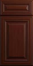
| Charleston Linen | Charleston, raised panel | "A soft, traditional off-white" | The pale, warmer end, in a traditional door. |
Grey Shaker Elite: if your greige leans grey
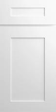
This is the line people find when they search for greige Shaker cabinets, and it's a fair match if the greige you like leans grey. Lily Ann calls it "on-trend grey" and "this neutral tone." In the lit kitchen shown at the top of this page it looks soft and slightly warm. In the plain product photos on the line page it looks cooler. That gap is exactly why you should see a sample in your own room. To push it toward greige, pair it with warm wood, a white counter and brass or black hardware rather than chrome.
York Driftwood Grey: the closest to a deep greige

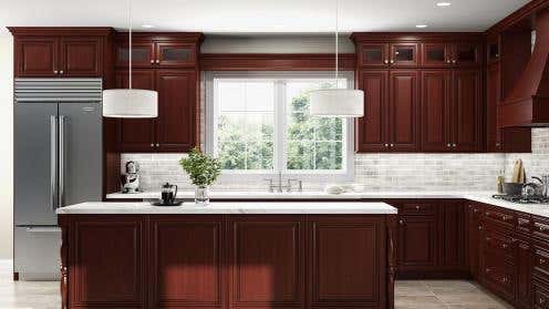
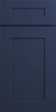
York Driftwood Grey is a darker grey with a glazed finish and visible wood grain, which brings in some brown. Our taupe cabinets guide makes the same call: it's the finish that sits where a cool taupe and a greige overlap. Lily Ann's own color guide calls it "a deep, moody grey." If you want a greige kitchen with some weight to it, sample this one first. Light floors and white counters keep it from feeling heavy.
York Linen and Charleston Linen: the pale end
If what you're after is a very light greige, close to off-white, the linen finishes are the place to look. Lily Ann's own pages describe York Linen two ways: "soft and creamy" on one page and "cool and airy" on another. That's a sign it shifts a lot with the light around it. Charleston Linen is described as a soft, traditional off-white in a raised-panel door. Neither is a mid greige, so compare them against a true white before you decide.
If your ideal "greige" turns out to be warmer and browner once you see samples, Lily Ann's Mocha Shaker (described as a "deep, warm finish") is on the taupe side instead.
A Two-Tone Greige Kitchen

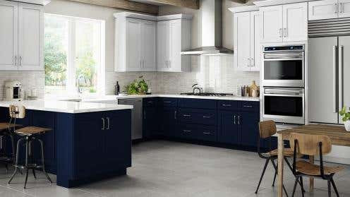
One way to get a greige look without one exact greige cabinet is to use two neighbors together. The kitchen above uses light York Linen on the walls and darker York Driftwood Grey on the island. Both are York-style doors, so the door shape stays in the same family and the color does the work. Together they read as a soft grey-beige kitchen, with the island giving it depth.
What Goes With Greige Cabinets

- Countertops: White or white-with-veining quartz is the easy match. It gives greige the contrast it needs. Avoid a counter that's nearly the same greige but not quite. That near-miss makes both look dirty.
- Hardware: Black and brushed nickel suit a greige that leans grey. Brass and warm bronze suit one that leans beige. Match the metal to the cabinet's warmth, not the other way around.
- Walls: Go clearly lighter than the cabinets (a warm white) or clearly darker. A wall color within a shade or two of the cabinets looks like a mistake.
- Floors: Light and mid oak warm greige up. Cool grey tile makes it read greyer. Very orange wood can fight a cool greige.
- Backsplash: White subway or zellige-style tile is safe. A stone-look tile with grey and beige in it ties everything together.
- Accent color: Greige works as a backdrop for navy, deep green or black, on an island, a range hood or open shelving.
For more ideas on the grey side of this palette, see our grey kitchen cabinet ideas.
How to Test Greige Before You Buy
Greige is the hardest neutral to judge from a screen, because it's defined by small amounts of warm and cool. Three quick tests settle it:
- Hold it next to a true white and a true grey. A greige should look warmer than the grey and darker than the white. If it looks identical to the grey, it's a grey.
- Put it on your floor and against your counter sample. These two surfaces will pull the cabinet warm or cool more than anything else in the room.
- Look at it morning and evening. North light makes greige cooler. Warm bulbs make it beige-er.
Paint color names don't transfer to factory cabinet finishes, so a paint chip is only useful for deciding which direction you like. The real test is a cabinet door. Lily Ann's line pages say the first two door samples are free. After that, door samples are listed at $9.99 each on the samples page, which also says sample costs are refunded on orders over $1,500 (both checked September 21, 2026). Order two finishes from different spots in the table above, not two that are nearly the same, and compare them in your own kitchen.









Comments